Twhirl, Twitterrific and Adobe Air
I’m logged in to Twitter all day, every day (twitter.com/jackbaty). It’s become an important part of my workflow, or whatever you call what I do these days.
That being the case, a good desktop Twitter client is important to me. I’ve been using Twitterrific since shortly after I learned how to spell it. Twitterrific is a very nice OS X app that looks good and works flawlessly for the most part, which is more than I can say for Twitter itself lately. My desire for playing with new software brought me to Snitter. Snitter was the first real Adobe Air app I ran for any length of time, but it crashed and behaved badly on my machine. Uninstalled it. (This could very well be fixed by now, but I haven’t tried it recently.)
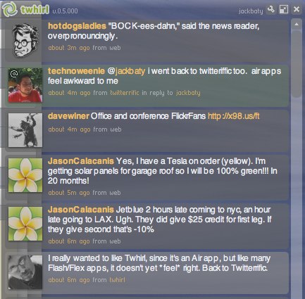
Today some folks were twittering about another Adobe Air based client, Twhirl. You know me, I had to try it at once! Grabbed the latest Air Beta and fired it up. Nice stuff: multiple Twitter account handling, themes, search, etc. I thought I was on to something. Then I tried using it and that’s where things started to go wrong. First thing I noticed is that the window would jump out from underneath the cursor whenever I clicked anywhere on the app. Not good, but what finally killed the experience for me was the text rendering. I’m a pretty forgiving guy when it comes to fonts and such, but the text was rendered terribly.

I experimented with a few different fonts but they all looked wonky. Does anyone know if this is an Air thing or is it something specific to my install? I can’t even read that. Text handling doesn’t feel right either. For example, selected text is black rather than my system’s highlight color. Dealing with Twitter’s 140-character-at-a-time limit makes these issues less of a real problem, but still. Oh and Air really needs Growl support.
I mentioned earlier on Twitter that Air apps “don’t feel right.” The above is a brief explanation why.
As I left the Adobe conference a few months ago, I said that “Air is a game changer,” and I still believe that. Over the past months, we’ve been building a number of Flex apps at Fusionary and so far the results have been outstanding. Flex apps may have some challenges to overcome, but improving the user experience in a browser is a lot easier than improving upon that of native desktop apps. I’m looking forward to leveraging web work on the desktop. Someday.
As for Twhirl and Snitter, they’re great early attempts using Adobe Air. I like that they’ll keep the pressure on Iconfactory to improve Twitterrific. The problem is that I’m not going to use them day to day just because they’re Air apps. They have to be better apps, and they’re not – yet.
 Jack Baty's Weblog Archives (2000-2020)