Tinderbox 4.5.

The release of “Tinderbox 4.5”:http://eastgate.com/Tinderbox brings prettier maps, faster agents and new visualation options along with a boatload of incremental improvements. I’ve jotted down a few notes.
h3. Maps
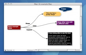
A software program’s aesthetics are important. How important is a matter of opinion, and many Mac developers spend so much time on the “Oooh Pretty!” parts of their apps that the software ends up beautiful, but actually _less_ usable. Tinderbox has never suffered from this problem. I’ve gone so far as to call parts of it “ugly” and complained about its visual details on a number of occasions. I can stop doing that now.
Somewhere between too plain and too pretty suits me best, and with version 4.5 Tinderbox now falls right where I like it on the aesthetic scale.
Almost everything looks better now, but maps seem to have benefited the most
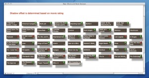
Serious designers probably scoff at drop shadows, but I love them. Lots of us normal people do. Good news then, because notes in map views now have drop shadows. That’s cool and all, but the best part is that the shadow’s attributes are configurable on a per-note basis. This means agents can modify the offset and color of the shadow, helping Tinderbox do what it does best – capture and visualize information. Here’s a simple example. I rate movies I’ve seen based on a scale from 1-5. In the following map, I’ve set the Review prototype to change the offset of the note’s shadow based on the rating. The higher the rating, the greater the offset.
So in this case, here’s the Rule for the Review prototype…
if(Rating>=3) {Badge="ok";} else {if(Rating<3 & Rating>0) {Badge="no";} else {Badge=;}} ; ShadowDistance=$Rating*5;
This is a simple example, but demonstrates the way Tinderbox thinks about visualization: drop shadows are pretty, but they shouldn’t just be for show.
h3. Inline Editing
Most decent outliners allow editing notes inline, and now Tinderbox does as well. This frightened me at first, but I’ve adjusted my muscle memory slightly and now it feels as natural as ever.
h3. Search
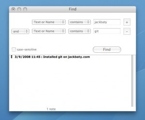
There’s not much point in creating or storing all sorts of text content in Tinderbox if you never plan to get it back out again. I search my Tinderbox documents all the time, and in 4.5 it gets better.
The ability to add multiple criteria is huge, and prevents me from having to create a temporary Agent to do the work for me. The window is also no longer a floater, which is nice.
h3. Visualizations
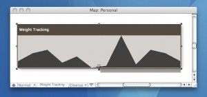
There is a new map pattern called Plot(). This is such a simple yet powerful thing, and my favorite new Tinderbox feature. Basically, you can set the pattern of a note in map view so that it will draw a simple graph of any data contained in each of its immediate children. Cool, eh?
The first thing I did after downloading 4.5 was to add “Plot($Number)” as the pattern for a container holding my weight tracking notes. Yep, I use Tinderbox to record my weight every few days. I was planning on creating an export template to dump that information into Excel, but now I don’t have to.
Now I can easily spot where that extra donut went.
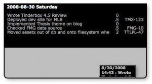
Another cool new thing is TableExpression. Setting TableExpression will cause a container in map view to render a tabular display of its contents, like so…
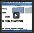
And just to show off, here’s a little movie showing how I avoid too much fidgeting with the mouse when reviewing my DayLog entries.
Neat, yes? All that took was setting a couple of attributes on the Review and Reset adornments.
Review OnAdd action: Height=5.5;TitleHeight=4;Width=11
Reset OnAdd action: Height=;TitleHeight=;Width=
It’s easy to forget that nearly _every_ attribute in Tinderbox can be set using Agents and Actions. Powerful stuff, when you need it – invisible when you don’t.
h3. Conclusion
Each new version of Tinderbox brings thoughtful, useful new features. Version 4.5 is no exception. I hate to sound like an evangelist, but dammit there’s no reason not to love it.
 Jack Baty's Weblog Archives (2000-2020)